

Custom Advertising Projector Ideas to Turn Any Space Into a Brand Experience
2026-11-23
Most brand spaces don’t fail because the message is weak—they fail because the environment forgets to speak. A custom advertising projector changes that. Instead of static signage or rented screens, projection lets you bend light around any surface, turning lobbies, storefronts, event corners, and even blank walls into immersive brand moments. With TNT projectors, the idea becomes practical: no two setups have to look alike, and no space is too awkward to activate. This post explores fresh ways to use custom projection to stop scrolls, hold attention, and make your brand feel less like an ad and more like an atmosphere.
Project Your Logo Where No Static Sign Could Fit
A blank wall becomes a canvas only after sunset. Sand dunes, curved glass, the side of a moving truck — these surfaces reject rigid signage. A projected logo slips into the texture of the moment, bending with the architecture instead of fighting it.
Think of a trade show booth where the backdrop is a sheet of falling water, or a pop-up event on a cobblestone alley. Static prints would look clumsy. Projection lets the mark breathe — sharp one second, softly diffused the next, adapting to any material that catches light.
Turn a Plain Facade Into a Rotating Campaign
A blank storefront rarely earns a second glance. By layering interchangeable panels, magnetic graphics, or low-profile digital strips onto the existing surface, that static face becomes a stage. The trick is to treat the facade as a rhythm, not a poster: change one visual element every few weeks, keep the core layout stable, and passersby start looking for what is new before they even realize why.
Rotation works best when the shifts feel intentional rather than random. Pair a fixed brand mark with rotating product highlights, seasonal color blocks, or short messages timed to local events. Even without a full video wall, simple backlit frames or vinyl overlays can create the sense of motion and update. The facade stops being a background and starts behaving like a quiet, ongoing invitation.
Use Light to Put Product Details in Unexpected Places
A small cutout in the corner of a box can turn a plain shelf into a quiet brand moment. When a spotlight hits the package, the shape of a key ingredient or a signature pattern appears on the wall behind it, giving shoppers a reason to pause without any extra signage.
You can also hide details in plain sight with inks that only show up under certain light. A care label, a sizing note, or a short product story stays invisible in normal store lighting but becomes readable near a window or under a display lamp, turning a basic spec into a small discovery.
For products with transparent or reflective parts, place a focused beam so it casts a readable shadow onto the table or shelf. The projected texture, logo, or instruction works best when it is slightly off-center, so people notice the light first and the information second.
Create a Storefront That Changes After Sunset
Most storefronts settle into a single mood all day, but the best ones shift once the sun drops. The storefront that changes after sunset doesn't need a full redesign—just a deliberate switch in light, depth, and focal points. What reads as clean and bright at noon can feel flat by evening, so the transition might start with warm perimeter lighting that pulls the entrance forward while the surrounding street recedes into shadow.
A few well-placed fixtures do more than a wall of generic floodlights. A narrow beam across a single display, a backlit sign with slight flicker, or a window glow that mimics candlelight can alter how people read the shop from the curb. At dusk the window display often benefits from less even illumination—dark pockets between lit objects give the glass more dimension and make passing pedestrians slow their pace instead of glancing past.
The change should feel like a shift in behavior rather than an afterthought. When the same storefront becomes moodier and more selective after dark, it rewards attention and gives the neighborhood a subtle landmark. That kind of presence tends to linger longer than a static facade ever does.
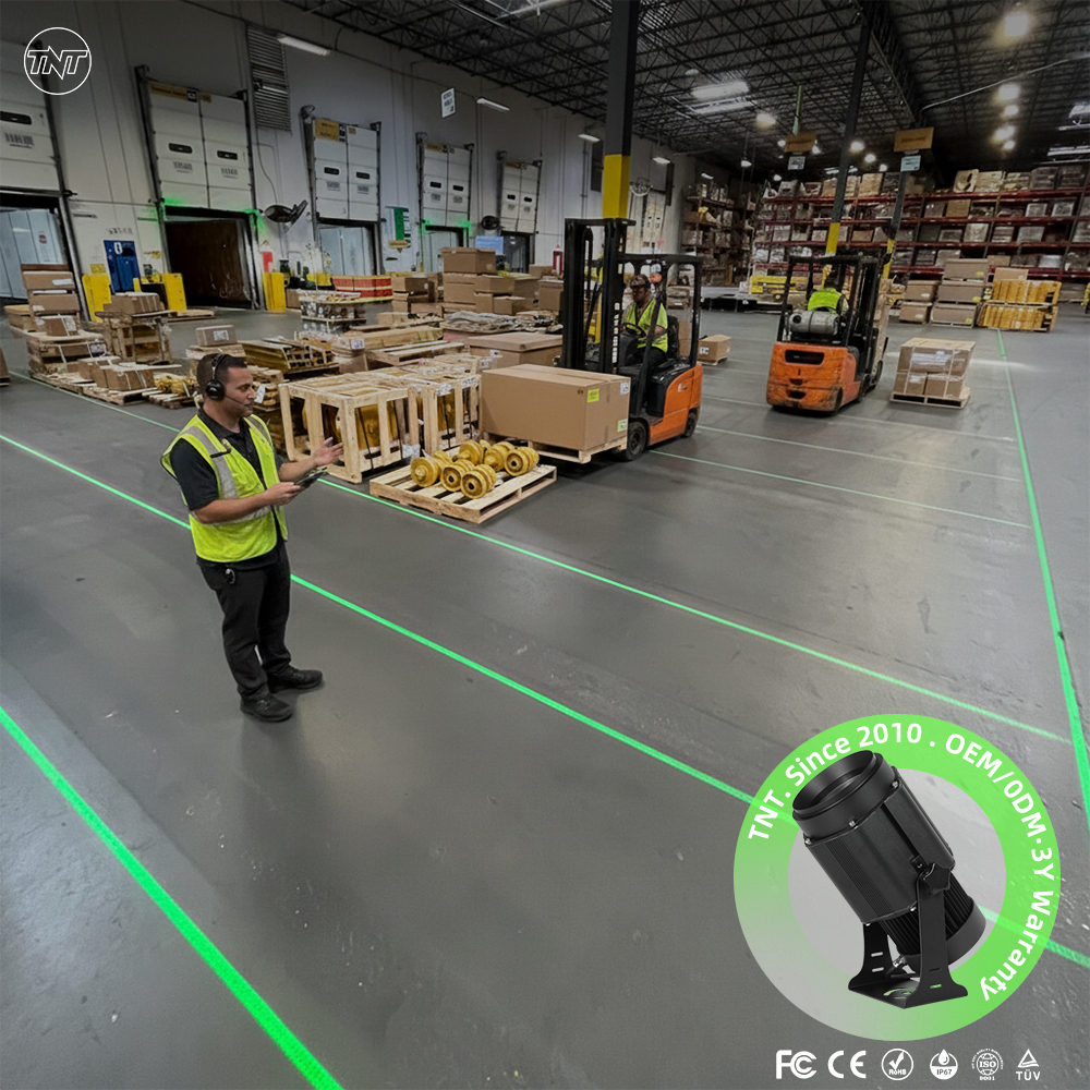
Make the Floor Guide Customers Through the Story
Walking into a space should feel less like entering a store and more like stepping into the middle of a conversation. The floor itself can carry that narrative when it stops being a passive surface and starts behaving like a quiet guide. Think about how a worn wooden path through a farmhouse kitchen tells you where people naturally gather, or how a shift from rough stone to smooth tile underfoot signals that you have left the everyday world and entered somewhere more considered. The goal is not to decorate the floor, but to let it whisper directions: pause here, look up, move toward the light.
A floor can steer attention without a single sign. A change in material or tone can mark a threshold, a gentle curve of inset stone can nudge a visitor toward a display, and a deliberate break in pattern can slow someone down at exactly the moment they need to notice a detail. The trick is restraint. When every square foot shouts for attention, nothing feels like a discovery. But when the floor offers small, almost subconscious cues, customers begin to move through the story you have laid out, turning corners not because they were told to, but because the ground beneath them made it feel natural.
The most memorable floors are the ones that feel inevitable, as if the space could not have been any other way. That sense of inevitability comes from designing the floor as part of the larger narrative, not as a backdrop. A dark, textured tile might absorb the noise of a busy entryway, giving people a moment to orient themselves before the story unfolds. A warm, matte surface might pull them deeper into a room, promising something worth lingering over. None of this needs to be explained. A floor that truly guides does its work in silence, leaving customers with the feeling that they found the story on their own, even though you laid every step of it for them.
Let Projected Textures Rebrand a Space Overnight
A coat of paint takes days to cure, but a projector can reskin an entire room after the last employee leaves. By mapping visuals to walls, ceilings, and even floors, you can wash a dated lobby in brand colors or turn a blank event hall into a layered, moving backdrop. The change is physical only in light, which means it can be undone by sunrise without patching, sanding, or repainting.
The trick is treating light as a material rather than a screen. Instead of one flat image, multiple projectors can wrap around columns, sharpen edges with masking, and let textures fall across surfaces with natural shadows. A concrete wall can read as aged plaster, brushed metal, or dense foliage depending on what the night crew dials in.
For rolling rebrands, this works best with a stored library of texture packs and mapped presets. A venue can shift from product launch to private dinner by swapping one file, not furniture. That kind of overnight flexibility usually requires construction or a new lease; here it only requires darkness, a power outlet, and a reason to surprise people in the morning.
FAQ
Try turning transitional zones into quiet storytelling areas. For example, a hallway leading to fitting rooms can become a shifting color field or a floor path of animated petals that guides people toward a new collection. This tends to feel more like an environment change than a standard logo loop on the wall.
Keep them out of dining and lounge sightlines where people sit for long periods. Instead, use elevator lobbies, ceiling coves, stairway walls, or the area behind the reception desk. Slow motion, warmer color temperatures, and visuals that resemble light installations rather than promotions usually blend in better.
Abstract movement, oversized typography with very few words, and real-time touches like countdowns or weather-reactive patterns often work better than static logos. They feel like part of the space and invite a second look without demanding much effort from the viewer.
Yes, but it depends on brightness and placement. You'll usually want a high-lumen projector with a short-throw lens, a shaded wall or overhang, and a surface that is light in color but not glossy. Content should avoid fine text and rely on strong contrast and simple shapes.
Stair risers, mirrors, plant walls, bar backsplashes, semi-transparent fabric, and even mist or water surfaces. These surfaces add depth and let the same visual feel different depending on the angle, which helps a modest setup look more intentional.
Start with two or three abstract motion loops and add a short message in a consistent typeface. Small changes in color, speed, or cropping can make one loop feel like several. A single recognizable shape or gesture is usually more memorable than trying to produce a complex film.
Schedule changes around the day, weather, or inventory. For example, rain can trigger umbrella patterns and a warm drink note, evening can shift to slower ambient visuals, and a pop-up opening can show a countdown. This makes the projection feel responsive rather than pre-recorded.
Look at dwell time near the projection, how often people take photos or videos, whether foot traffic moves into a specific area, and how many customers mention the display or use a related code. These signals are often more meaningful than simply counting how many people walked past.
Conclusion
A blank wall, a narrow corner, or an awkward architectural ledge can become your most flexible branding surface once a custom advertising projector is involved. Instead of wrestling with static signs that never quite fit the space, you can cast a crisp logo across brick, concrete, or glass and adjust its size, angle, and brightness to match the surroundings. The same tool lets a quiet facade run through a rotating campaign after dark, giving passersby a reason to look twice without changing the physical build-out. Product details that normally stay buried on a shelf can float above the pavement, along a stairwell, or across a ceiling, turning overlooked surfaces into useful, memorable information.
Projection also shifts the character of a location with the clock. A shopfront that feels ordinary during the day can take on a different mood once the sun drops, relying on moving light to suggest a late-night menu, a limited drop, or a seasonal story. Indoors, the floor becomes a quiet narrator, guiding people from one moment to the next with arrows, linework, or short cues that would be impractical to paint and costly to redo. When a space needs a quick rebrand, swapping projected textures and color fields can change the entire visual identity overnight, no renovation required. The result feels less like advertising and more like an atmosphere that belongs to the place.
Contact Us
Contact Person: TNT SALE
Email: [email protected]
Tel/WhatsApp: 8613544277910
Website: https://www.tntprojector.com/